Case Study · 02Bizzabo · 2021–2023 · Product Design
Before, during, after:
Redesigning how people connect at events.
Bizzabo was built for in-person conferences. When COVID hit, the team pivoted fast — launching an entirely new virtual venue product in weeks. I led the design of the community space, Messages and Meetings — and then drove the research to understand whether they actually worked.
Role
Senior Product Designer → Mobile Lead
Platform
Web + Mobile (hybrid)
Research
3 events · 5,360 attendees observed
§ 02 — Starting point
A desktop-first MVP built for a world that hadn't gone hybrid yet
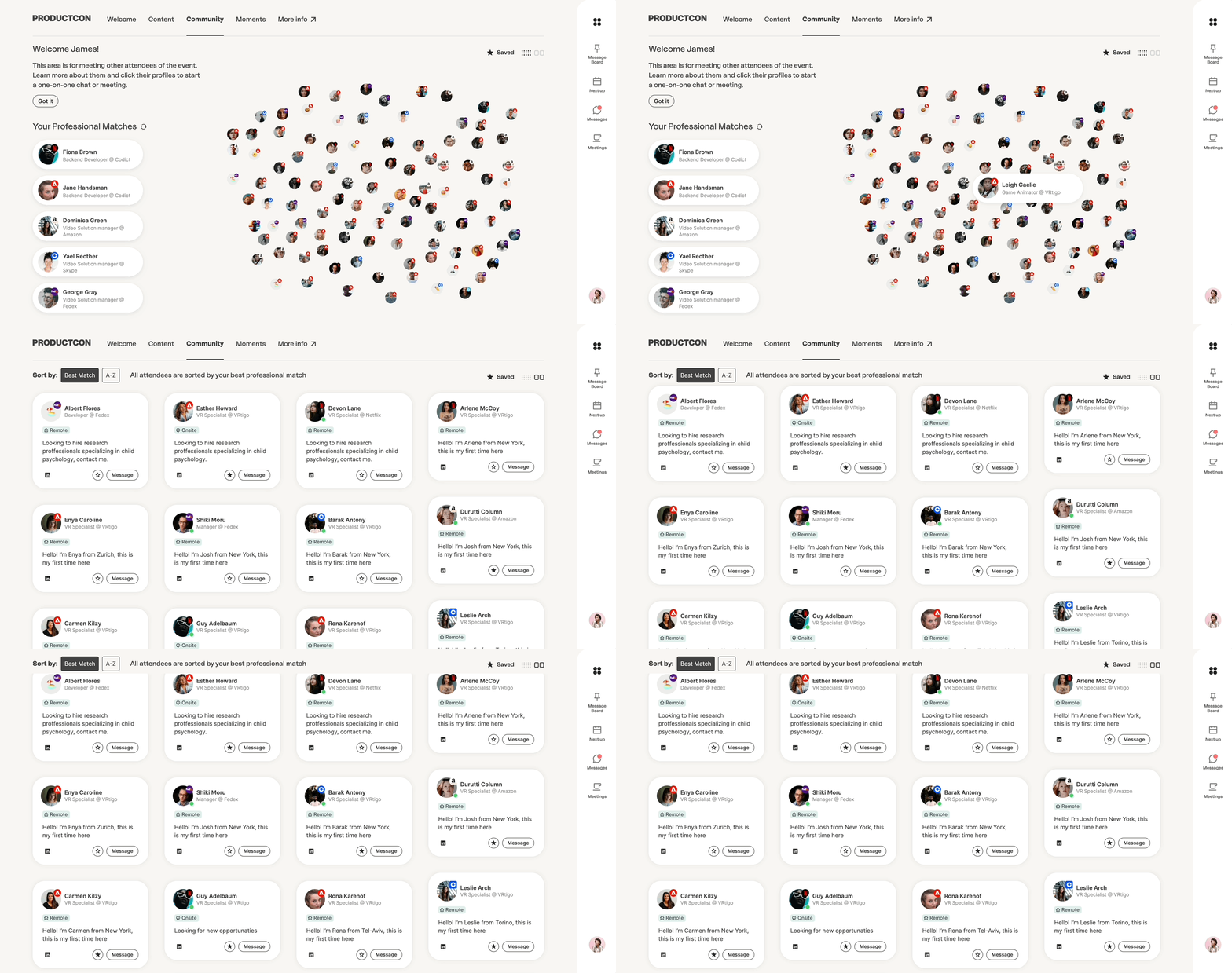
Bizzabo launched its networking feature for in-person events. By 2021, the world had shifted to hybrid — attendees split across physical venues and virtual rooms, on different devices, in different time zones. The product hadn't moved with them.
The feature existed. It just wasn't working. Attendees couldn't find it, didn't trust it, and weren't using it to connect.
100%
Registered attendees
~60%
Logged into the platform
~8%
Sent at least one message
Chart — Engagement funnel5,360 attendees across 3 events
Entered venue
100%5,360
Visited networking section
28%1,501
Sent a message
8%429
Key insight: The funnel was leaking at the top, not the bottom. Attendees who found messaging wanted to use it. Most never found it.
§ 03 — Research & method
Four research methods. One consistent finding.
Research ran across live events, post-conference interviews, quantitative surveys, and remote usability testing. The methods overlapped intentionally — each confirmed what the last had surfaced.
4
Research methods employed
3
Real events observed
5,360
Total attendees tracked
§ 04 — Research findings
Key observations from usability testing.
Task 016/6
Explore community & discover
All participants successfully browsed attendees and understood the filtering system.
Task 025.5/6
Set availability & schedule
One participant hesitated on the two-step flow. Minor UX friction, easily resolved.
Task 035/6
Send custom message
One participant sent without editing the AI draft. Most personalized the message first.
Task 045/6
Connect over content
Session impression feature was intuitive. One participant didn't notice the notification initially.
§ 05 — Product vision
Designing for a complete
attendee journey.
The hypothesis: if we give attendees the right tools at each stage of their journey — before, during, and after the event — the platform becomes infrastructure for professional connection, not just a schedule viewer.
We mapped the journey through Christy — a persona built from research — and designed against her real context at each stage.
BeforeArrive prepared, not cold
Feature 01
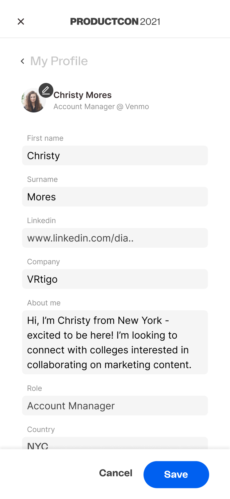
Explore the community
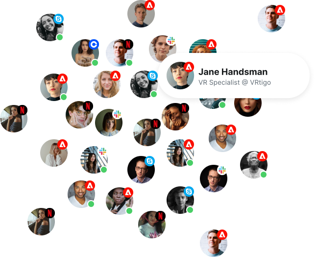
Before the event opens, attendees can browse the community, filter by interest and role, and build a mental map of who will be there. Reduces first-day cold-start anxiety.
Research hook: Attendees who explored pre-event were 2× more likely to reach out during it. The explore feature exists to close that gap.
Feature 02
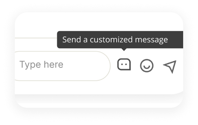
AI-assisted custom outreach
Rather than a blank text field, attendees get an AI-generated opening message — pre-loaded with shared context from sessions and profile overlap. They can send as-is or edit.
The insight: Cold outreach failed because nobody knew what to say. The AI draft doesn't replace the message — it removes the blank-page barrier.
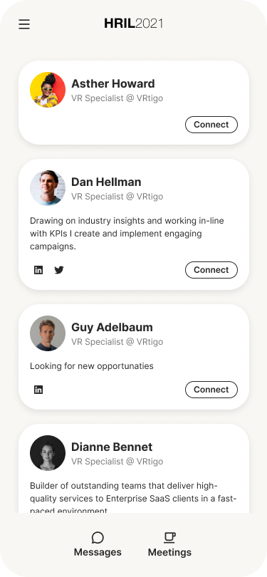
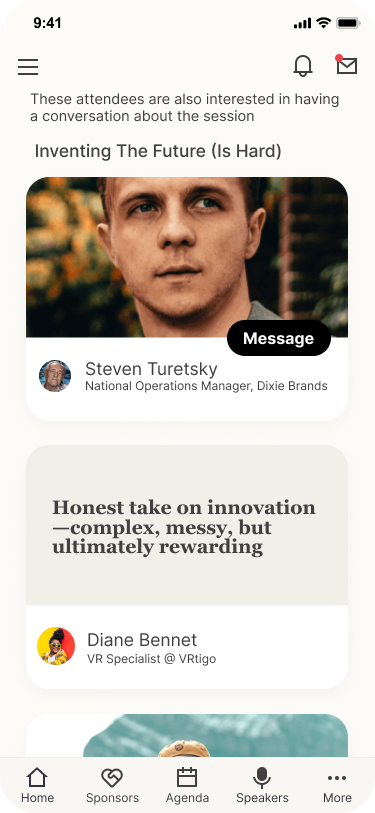
Community exploration → attendee profile view
Feature 03
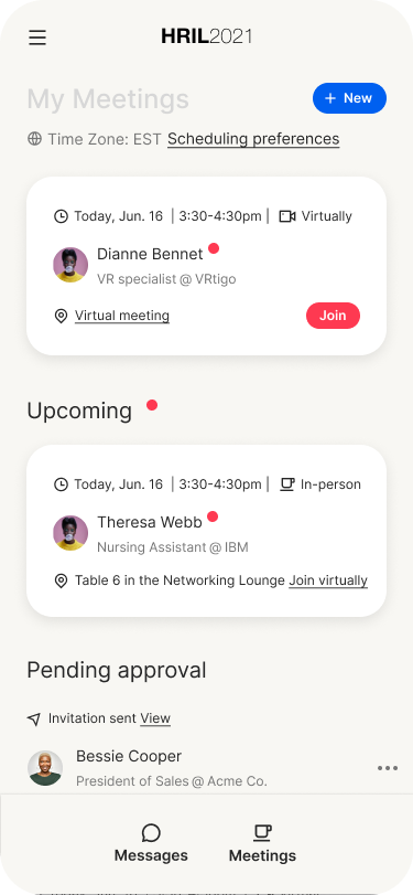
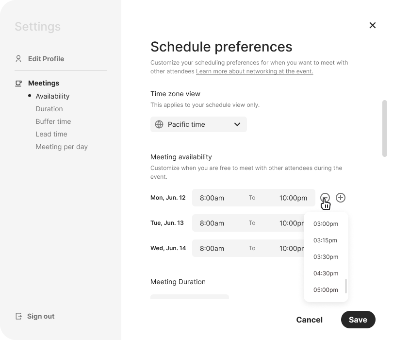
Availability & meeting scheduling
Attendees set their availability windows before the event. The system finds mutual overlap and proposes meeting slots — no back-and-forth, no scheduling overhead.
Design principle: Suggest the slot, don't ask the user to negotiate it. Mutual availability turns scheduling from friction into a single tap.
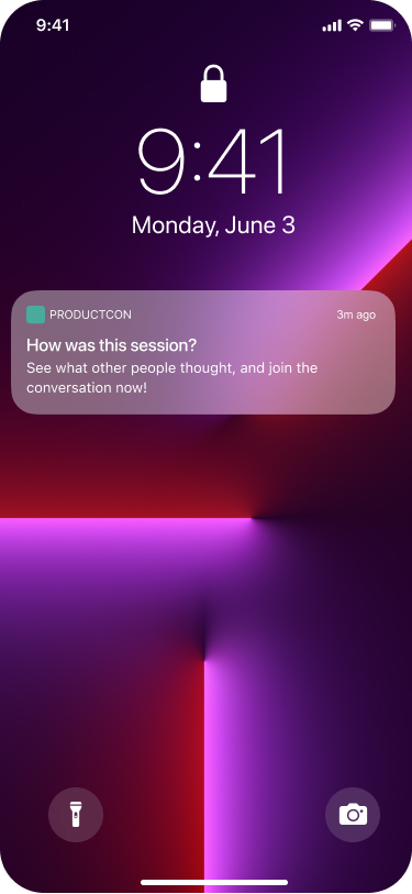
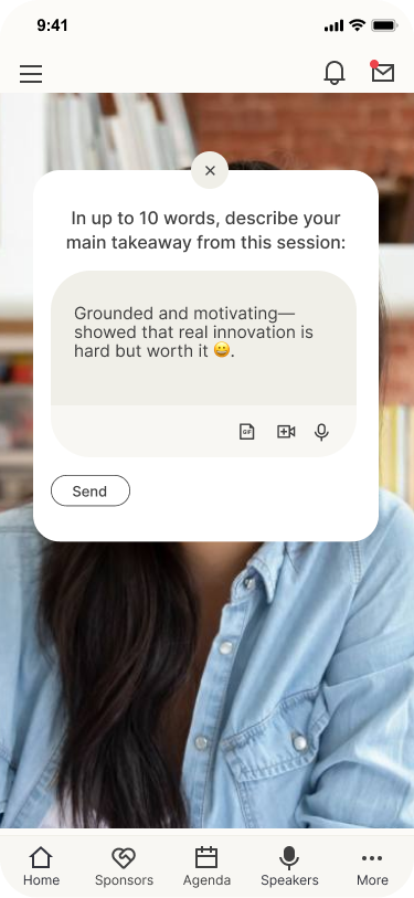
Session pages become social surfaces. Attendees see who else is watching, leave session impressions, and get a push notification when someone they'd match with reacts to the same moment.
23% of connections in our survey were due to a shared comment or question. This feature puts that signal front and centre.
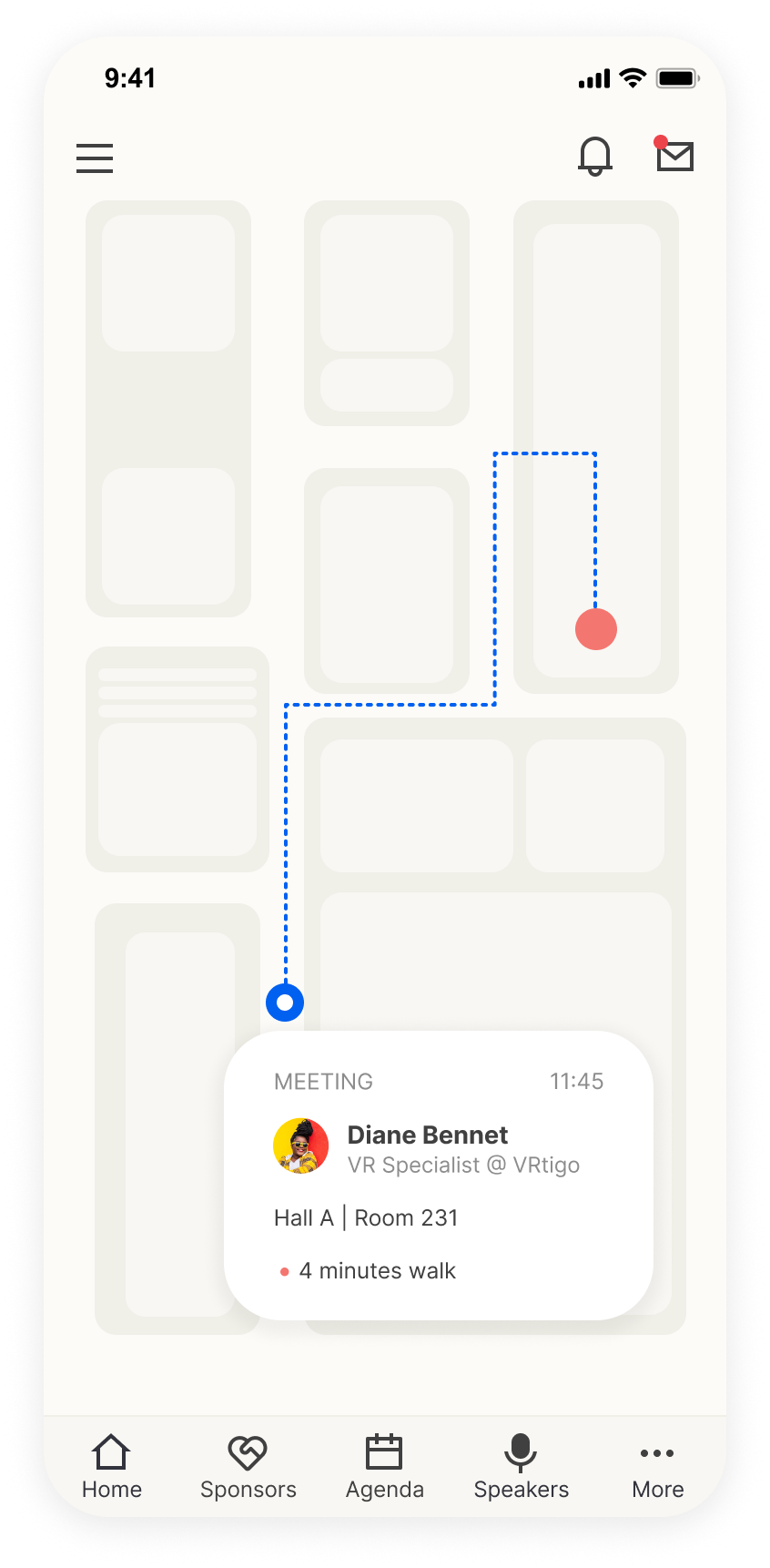
For spontaneous in-person moments: one tap sends a meeting invite with a suggested time and venue directions. Bridges the physical and digital layers of a hybrid event.
Hybrid-specific design: In-person attendees needed a way to signal availability instantly. Quick invite removes the overhead of scheduling when the moment is already live.
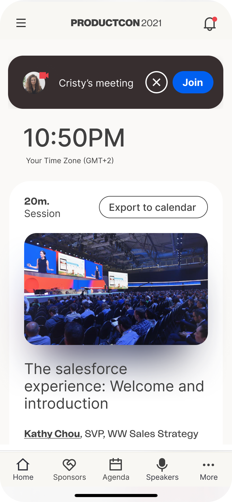
Quick invite with location → online meeting call UI
AfterKeep the connection alive
Feature 06
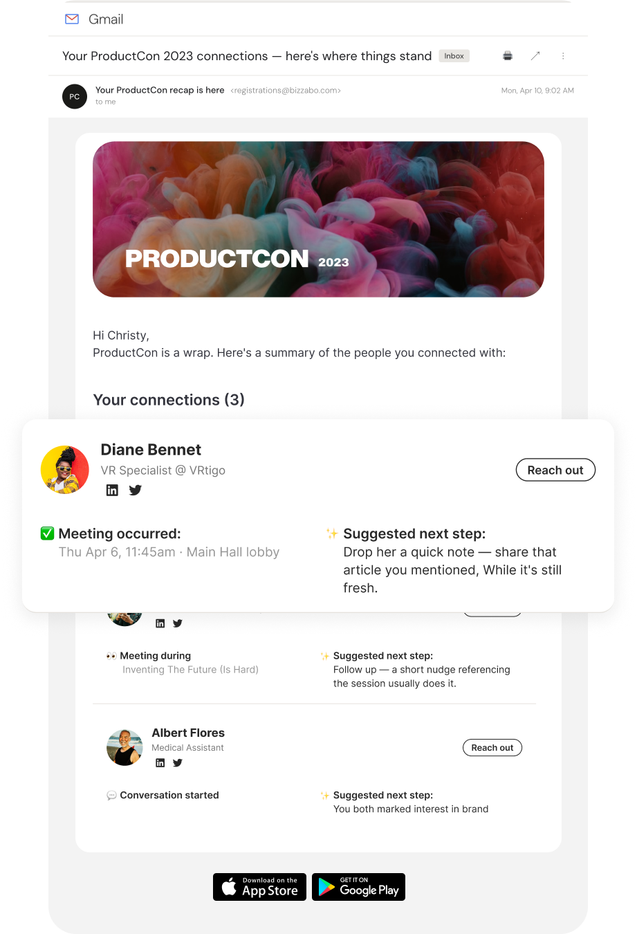
Post-event summary email
A personalised recap sent 24 hours after the event closes — showing connections made, sessions attended, and suggested next steps for each contact. The email extends the event's value beyond its close.
The problem it solves: Without a recap, post-event momentum disappears. The summary email turns fleeting connections into actionable relationships.
§ 06 — SummaryShipped May 2023
From desktop-first features
to a mobile-native networking system.
Six core features shipped across three phases: before (Explore, Messages, Scheduling), during (Connect over content, Meet Now), and after (Summary email). The platform became infrastructure for professional connection.
4.3/ 5
Average ease-of-use score
6/ 8
Completed both flows successfully
2×
More likely to message if engaged pre-event
Key insight
Context before capability. Stop asking what the feature can do.
Start asking where the user is while he uses it.